UI
LIBERRY
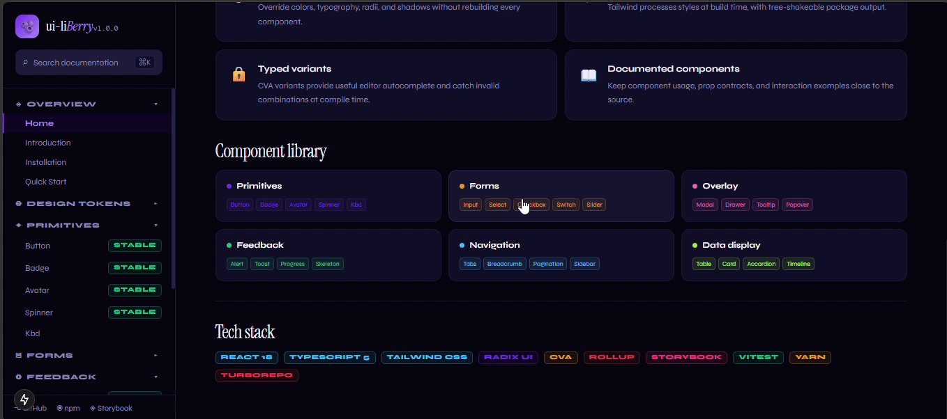
ui-liBerry is built for agency work: build the interface, theme the brand, document the system, ship the work.
It is a Turborepo monorepo whose product is one npm package, @ui-liberry/core: 15 accessible React components, nine hooks, design tokens and a Tailwind preset. Around it sit Storybook, a Next.js docs site and a playground app that exercise the library.
Change the brand,
not the components.
Colours are stored as CSS variables, and a Tailwind preset maps names like brand-600, surface and content-muted onto them. Dark mode only overrides the surface and content variables.
To re-brand for a client, you override a handful of variables in a stylesheet loaded after the library's. No component changes.
Three layers
of colour.
Accessibility
you do not have
to remember.
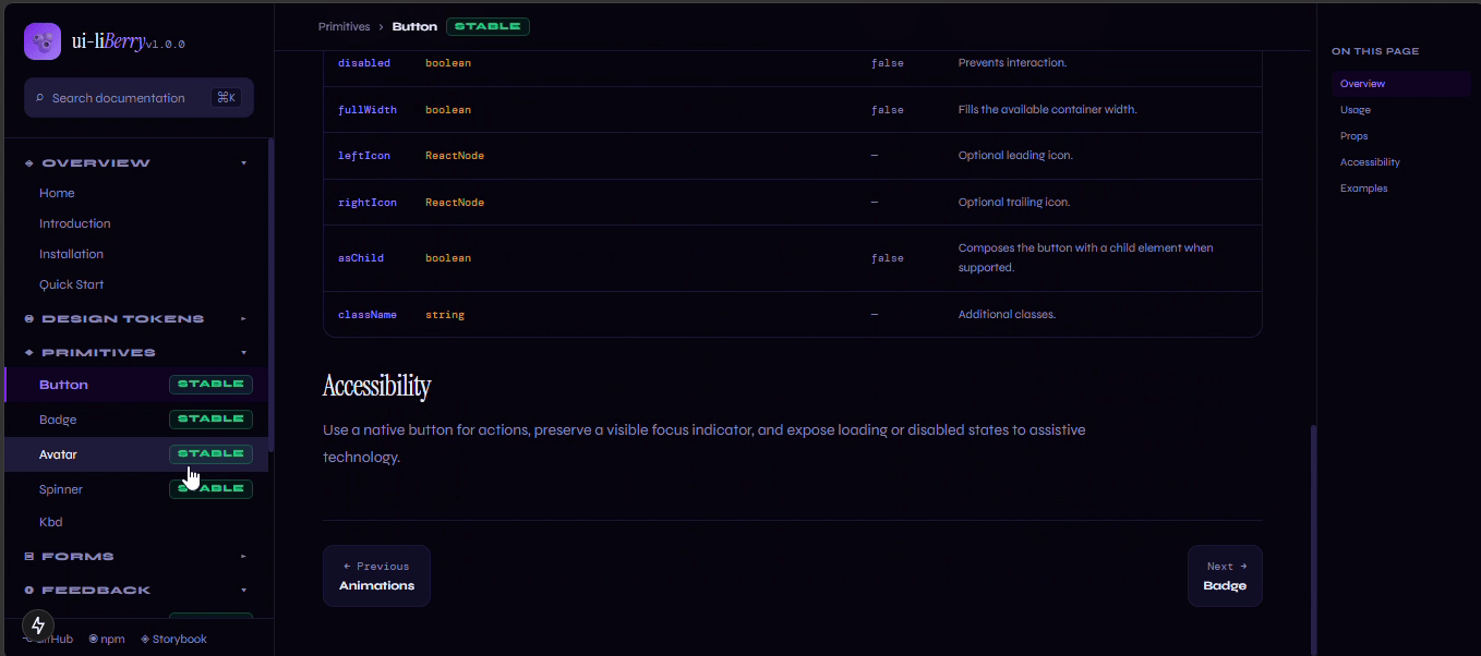
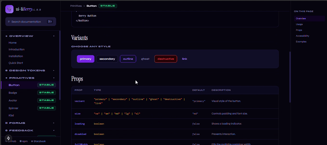
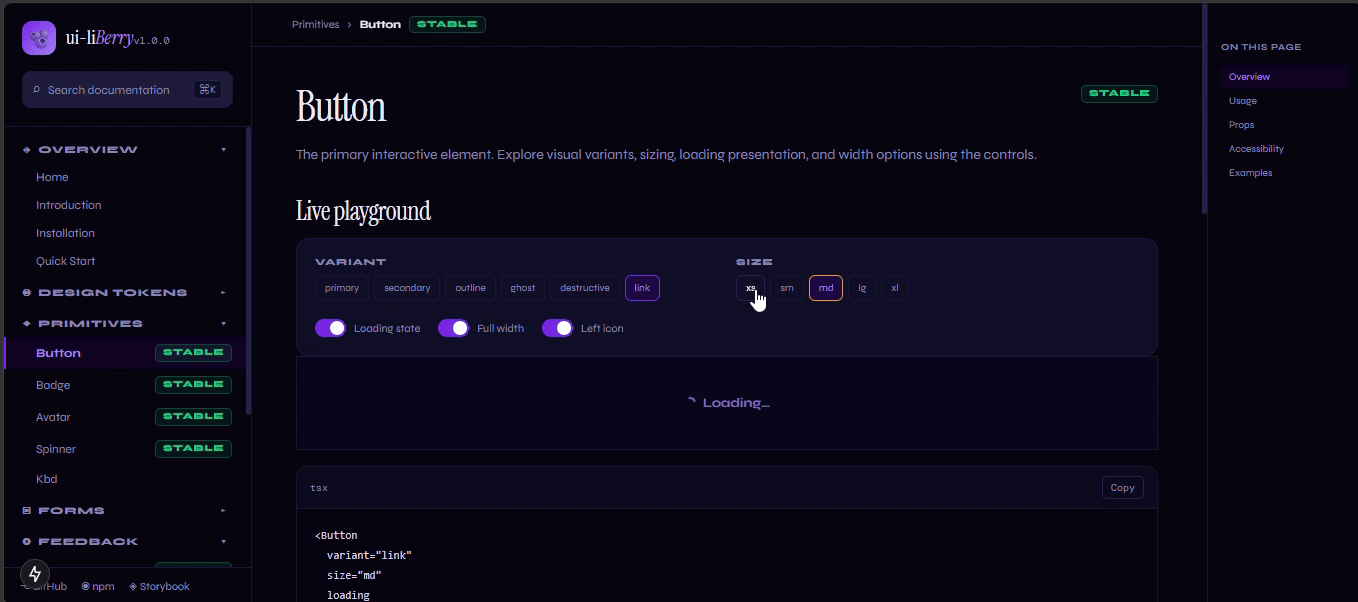
Inputs generate their own ids and wire up aria-describedby from whichever hint, success or error text is present. Buttons set aria-busy while loading. Overlays are thin wrappers over Radix, which supplies focus trapping and keyboard handling.
Every component follows the same recipe: typed variants, a class-merging helper, Radix where behaviour is hard, and forwarded refs.
Built to be
published, not just
demoed.
Rollup builds CommonJS and ES bundles with a use-client banner for the Next.js App Router, bundled type definitions, the stylesheet and the Tailwind preset as three entry points. CI runs typecheck, lint, tests, a size budget and Storybook accessibility checks.
Releases go through Changesets and publish to npm with provenance.
A design system
is a promise
about the next screen.
Small parts,
one shape.
const Comp = isAsChild ? Slot : "button";
const isDisabled = isDisabledProp || isLoading;

<Comp
  ref={ref}
  disabled={isDisabled}
  aria-disabled={isDisabled}
  aria-busy={isLoading}
  className={cn(BUTTON_VARIANTS({ variant, size, fullWidth: isFullWidth, className }))}
  {...props}
/>A design system is a lot of small decisions repeated. The ones that paid off were the dull ones: one recipe for every component, and one place where colour is decided.